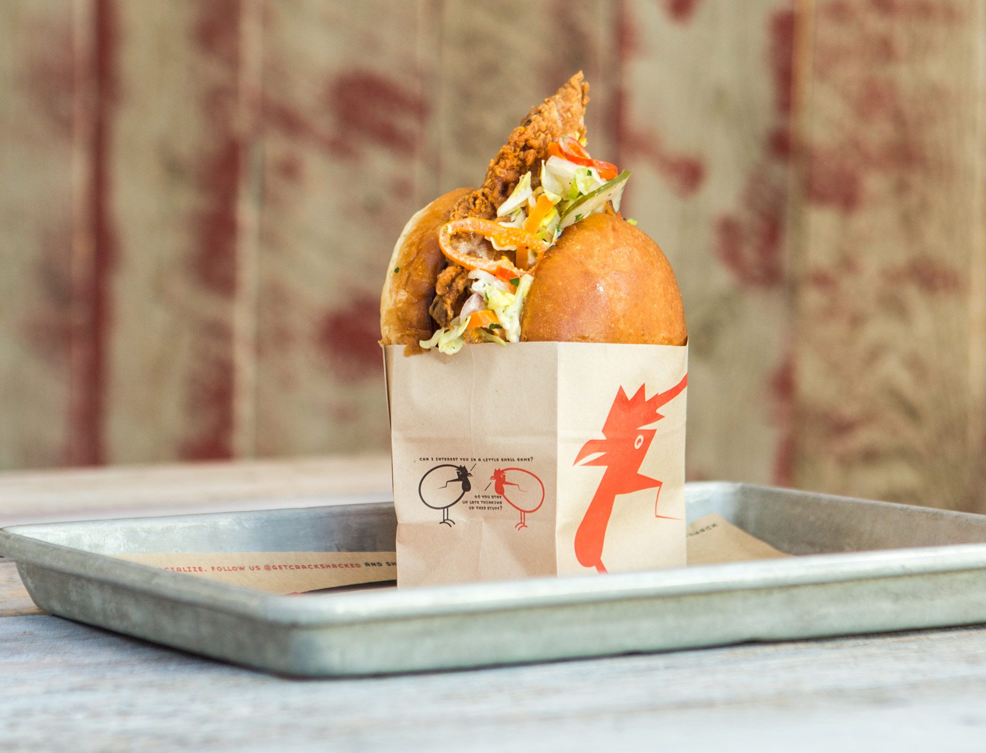
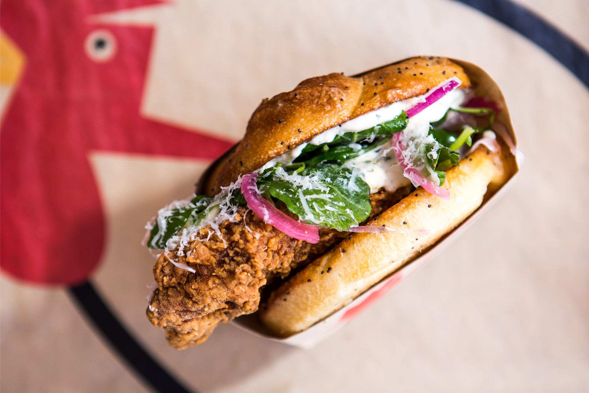
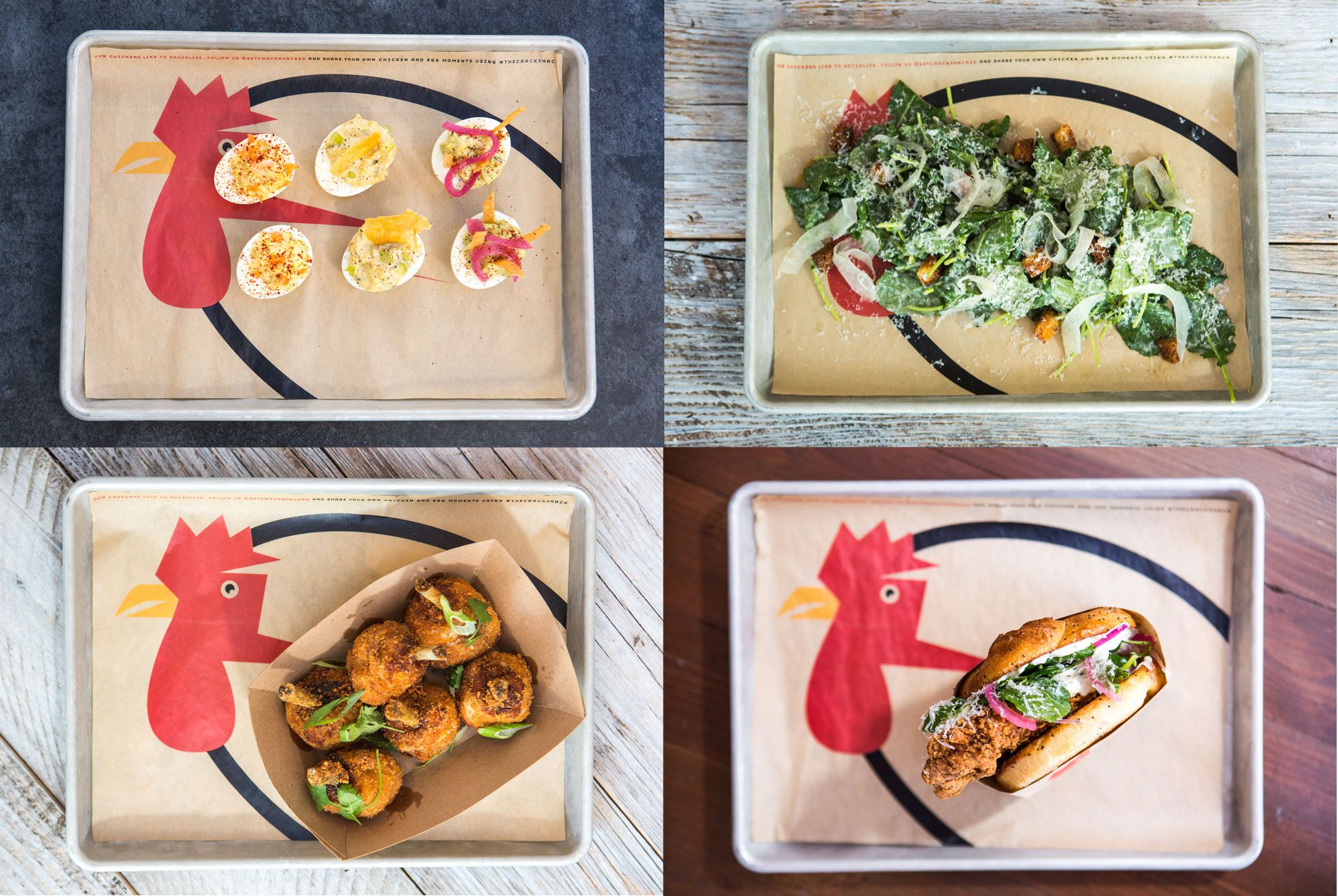
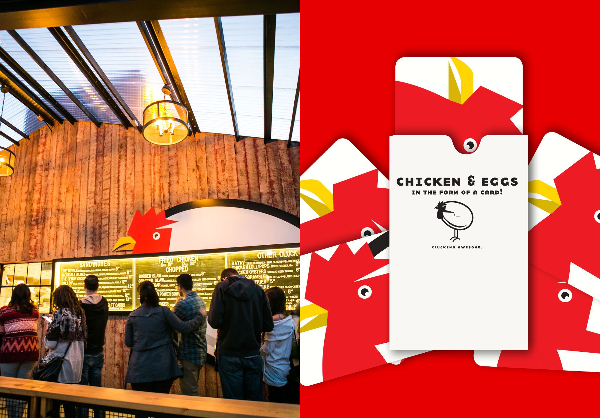
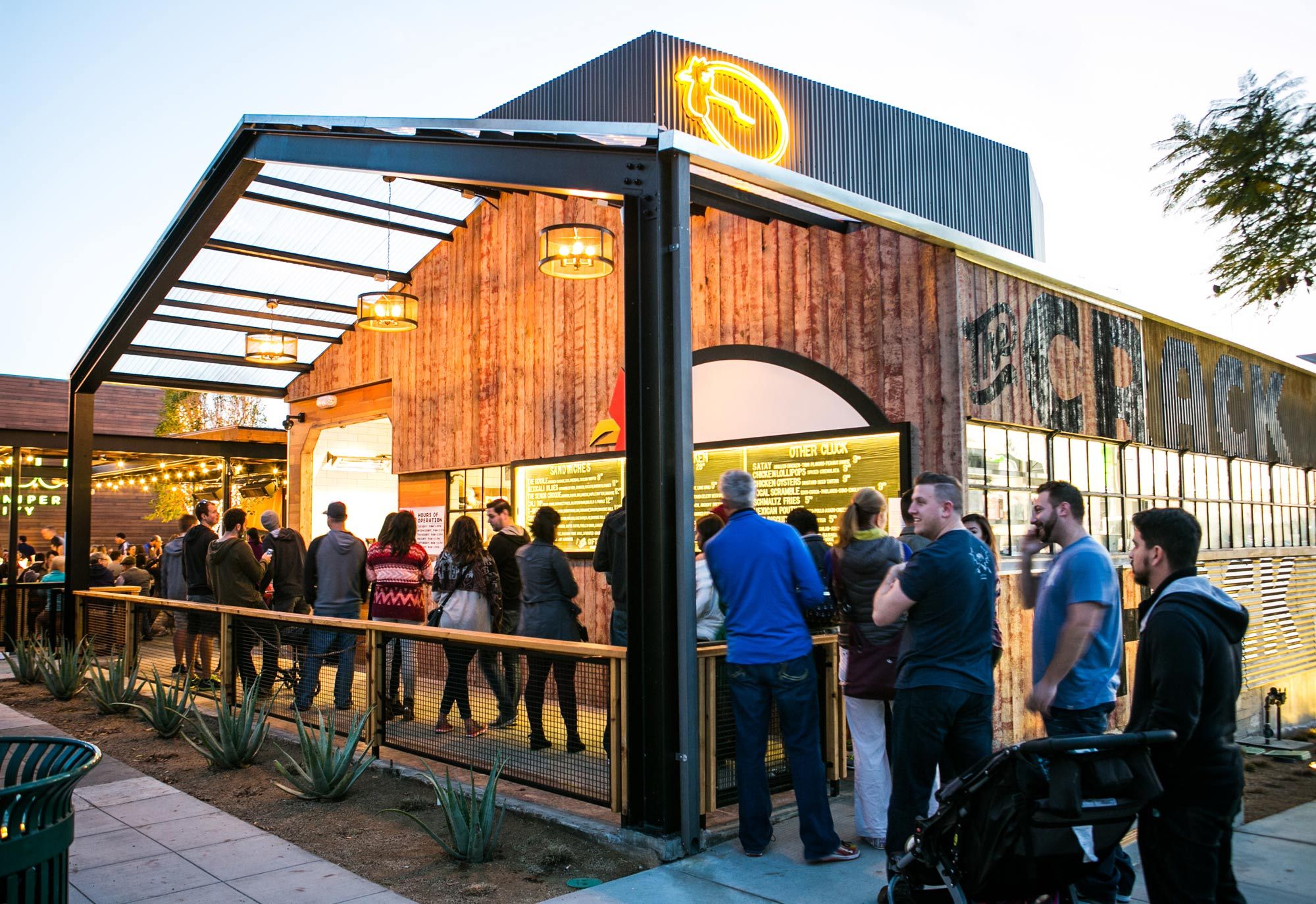
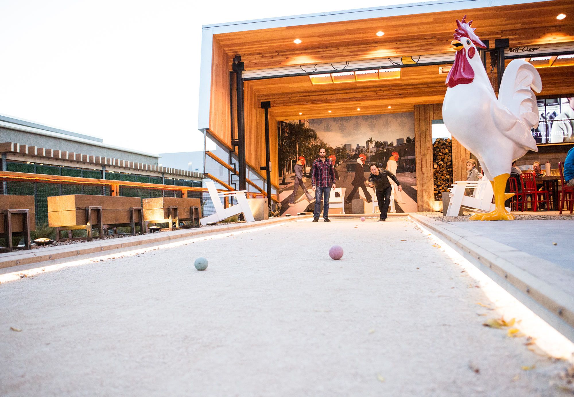
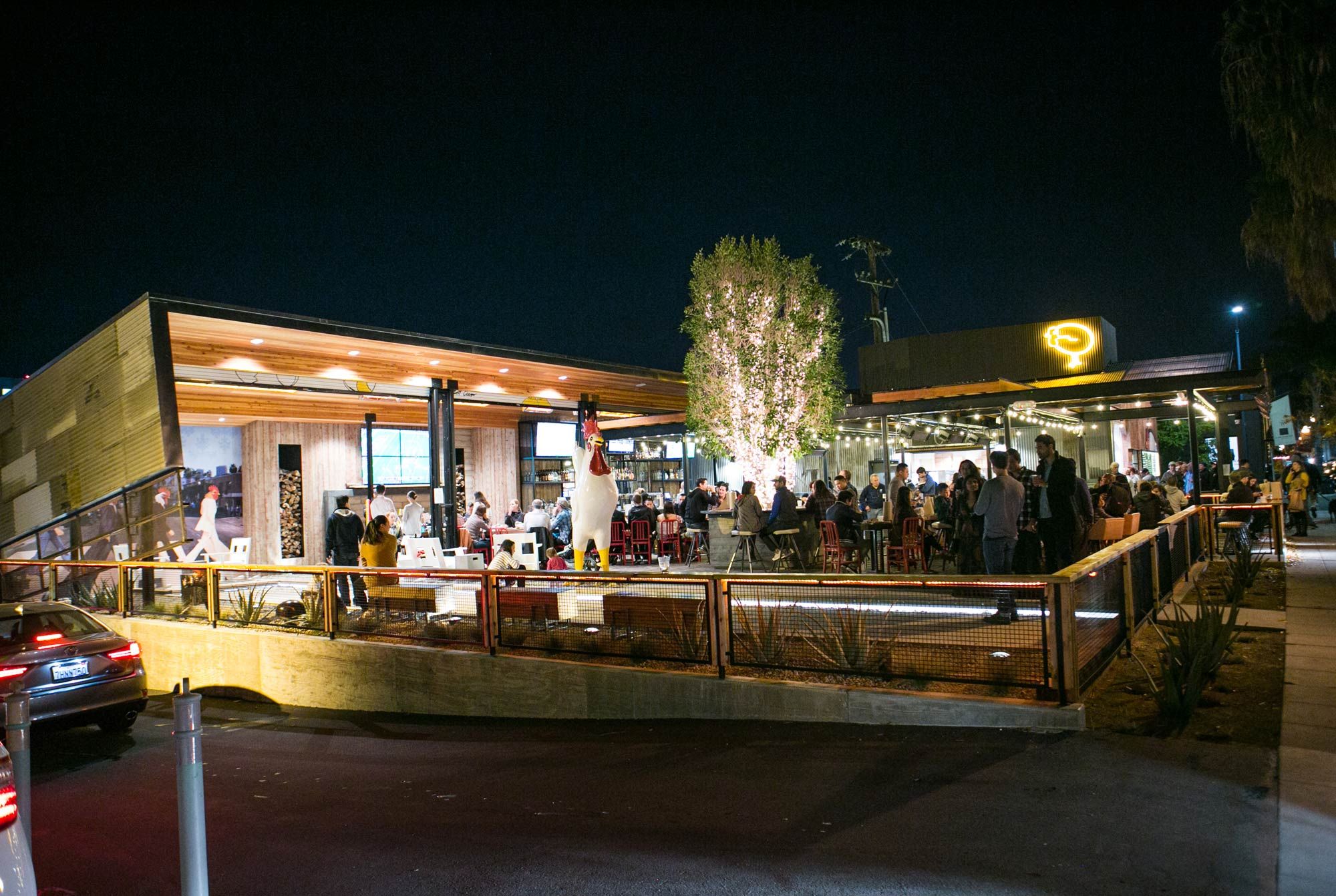
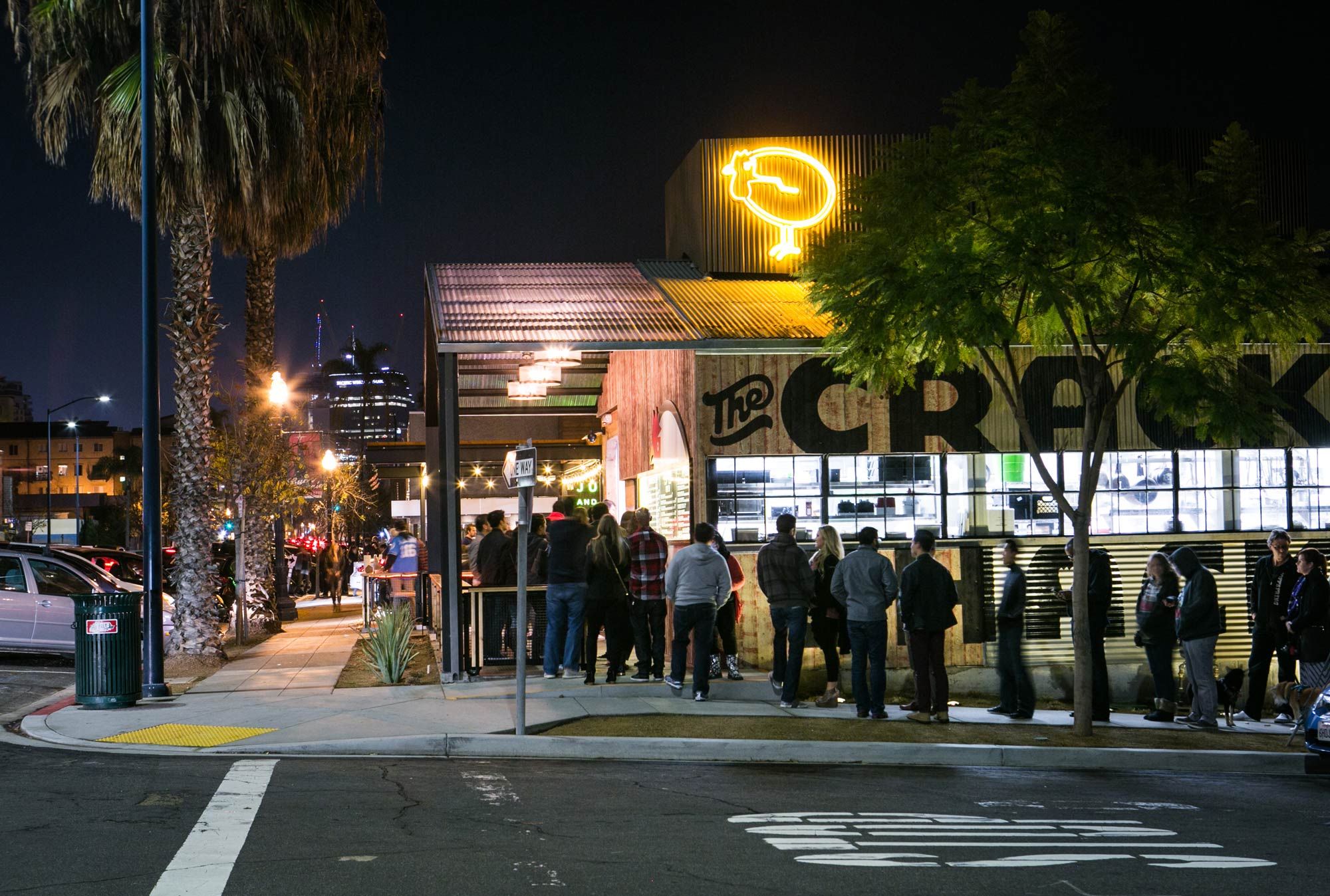
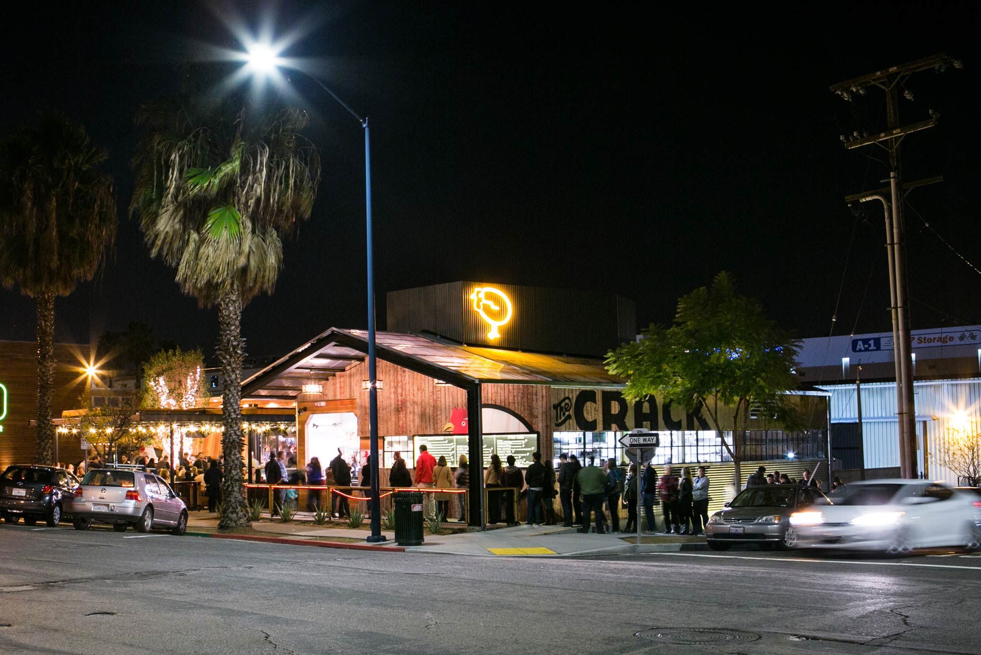
WHEN YOU GET A PHONE CALL FROM A CLIENT ASKING YOU TO WORK ON THEIR NEW PROJECT CALLED “THE CRACK SHACK” it’s a bit hard not to gasp. Now that it’s all said and done there couldn’t be a more perfect name for this in your face yet elegant all day chicken and eggs concept in San Diego, California. Currently one of the hottest expanding food chains out there, the original is located in what originally was, for lack of a better term, a metal “shack” on the far side of a parking lot, The Crack Shack is the place we all wanted in our lives but maybe didn’t know we needed.
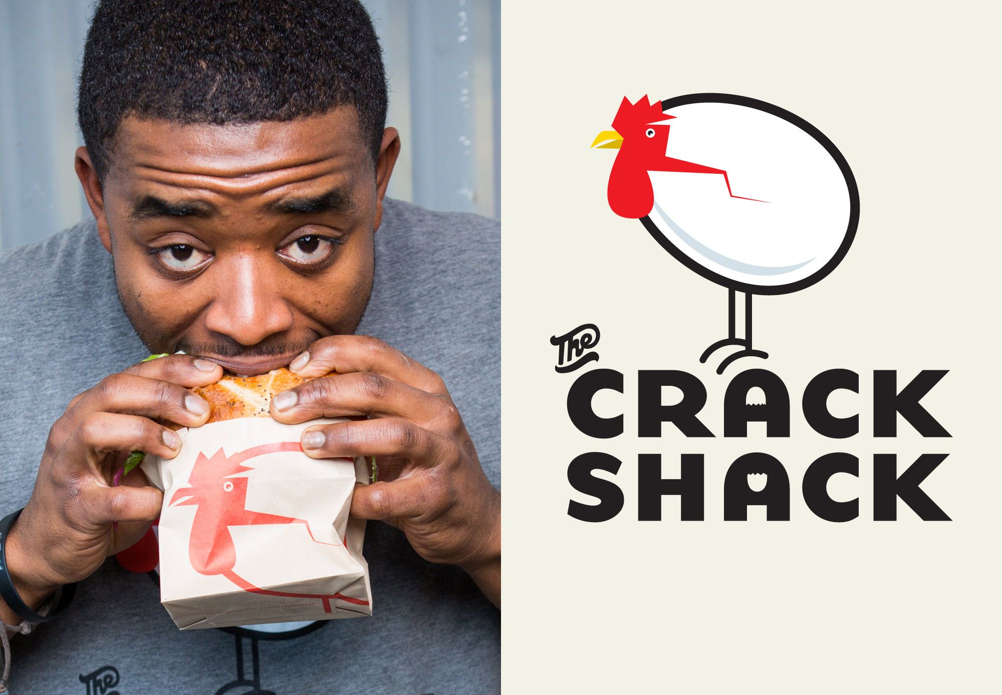
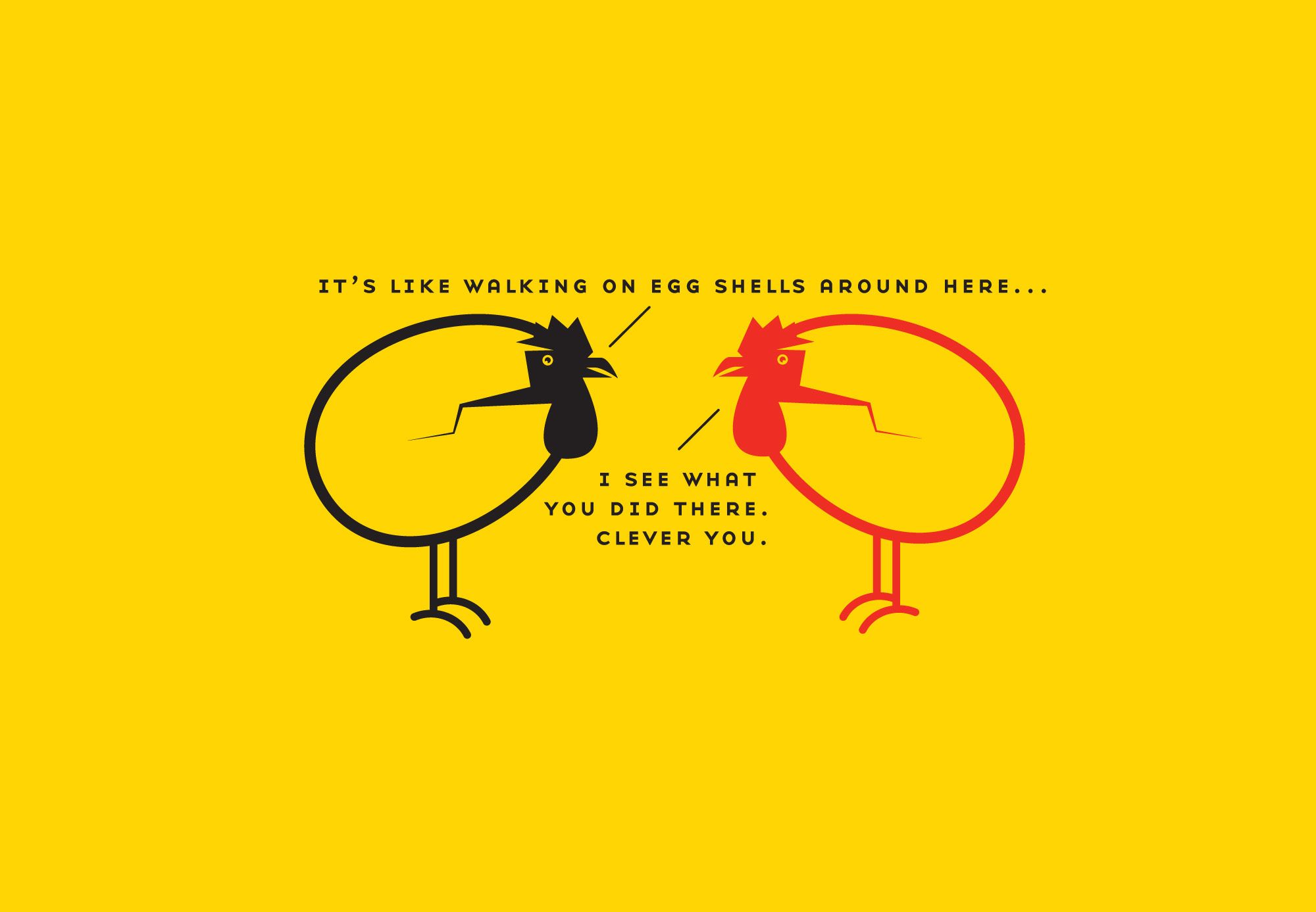
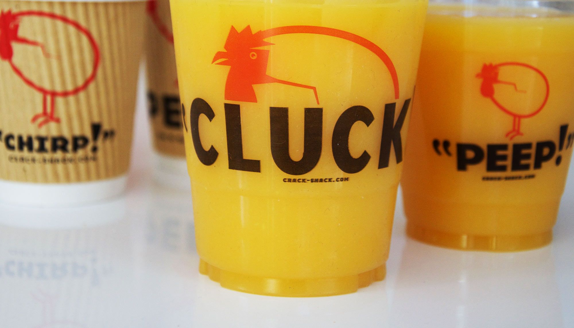
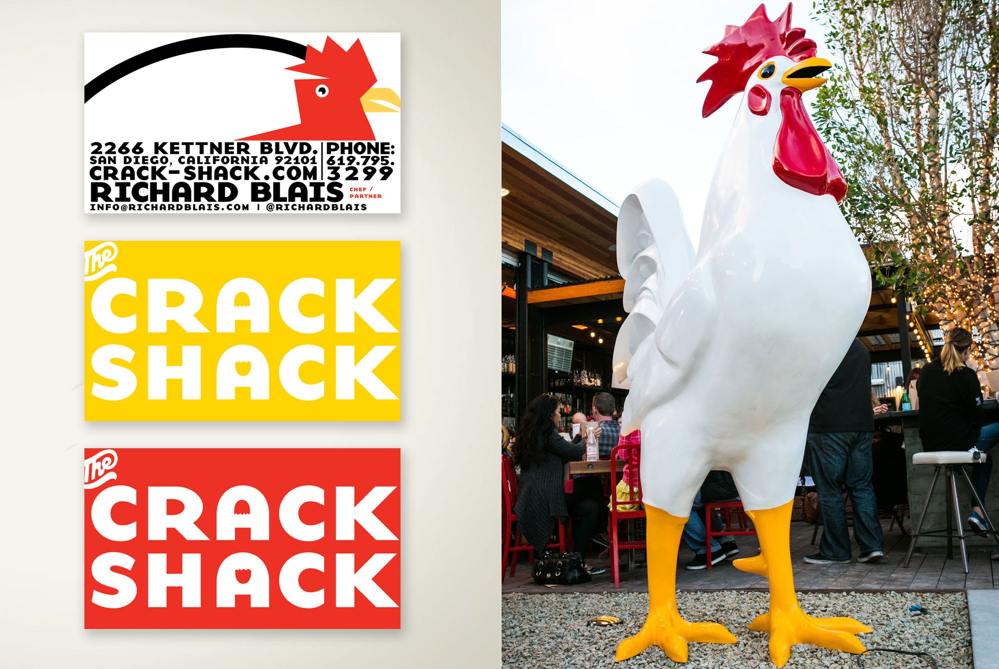
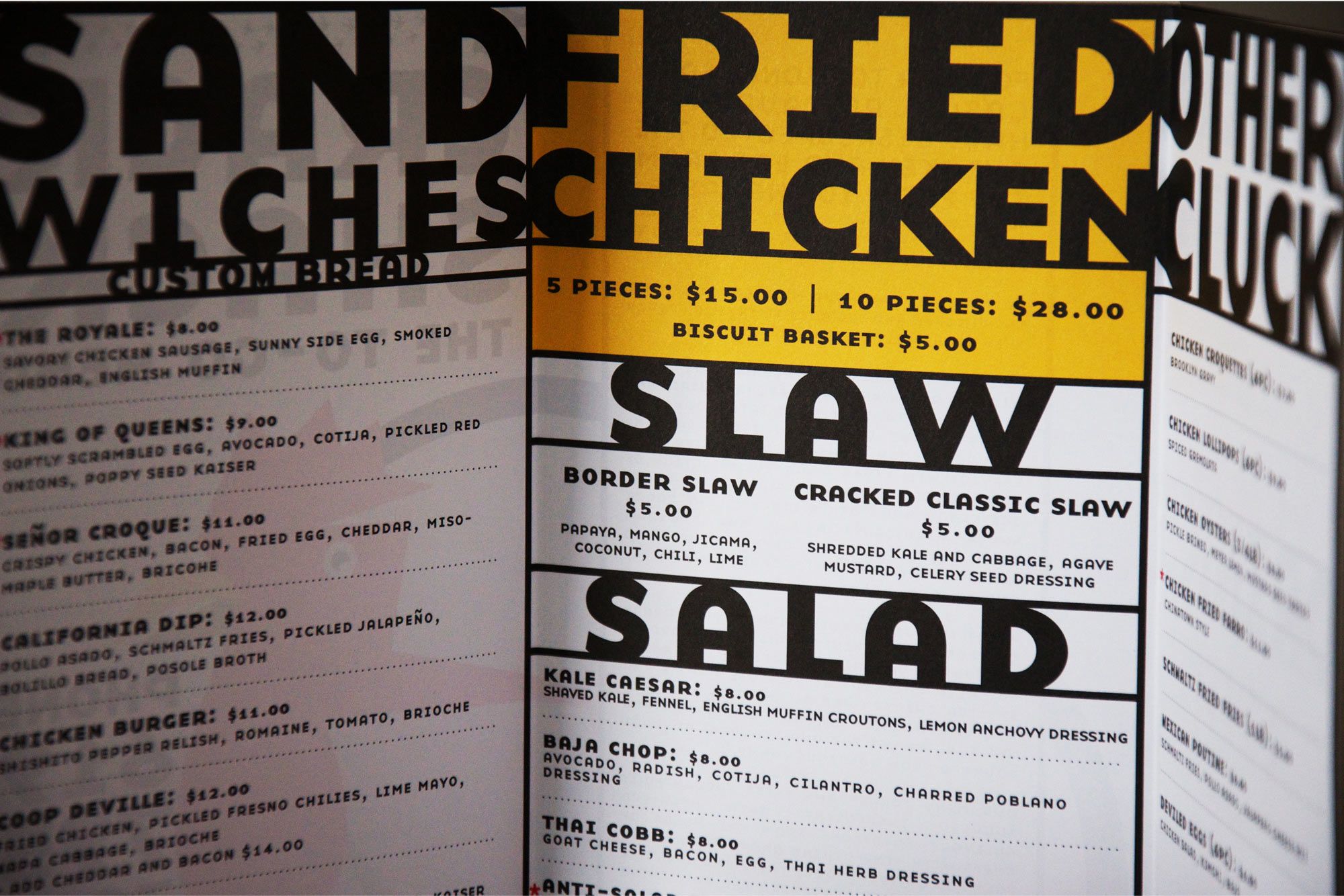
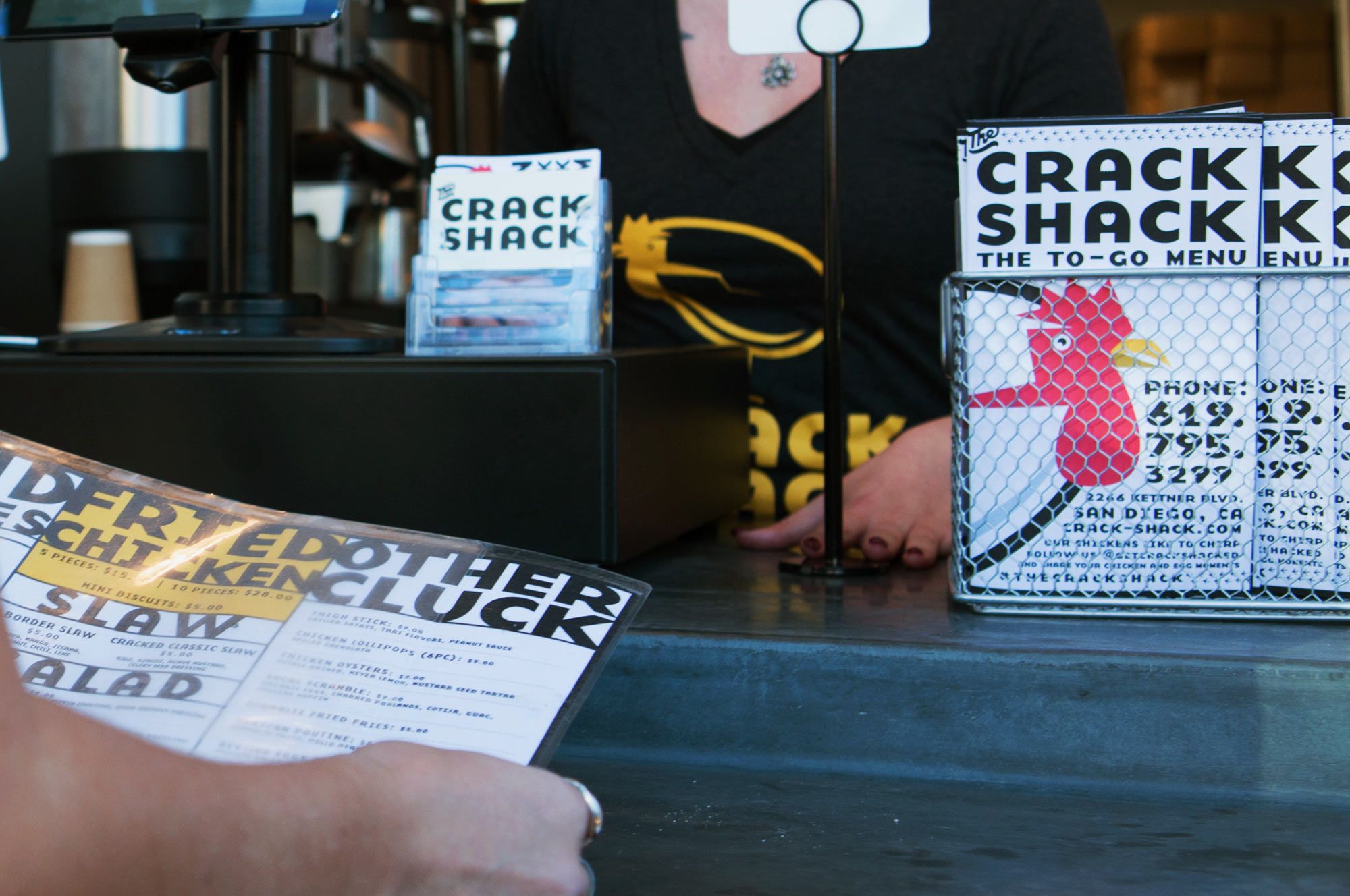
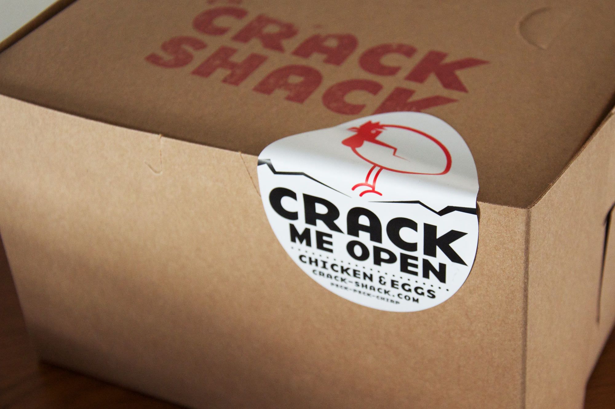
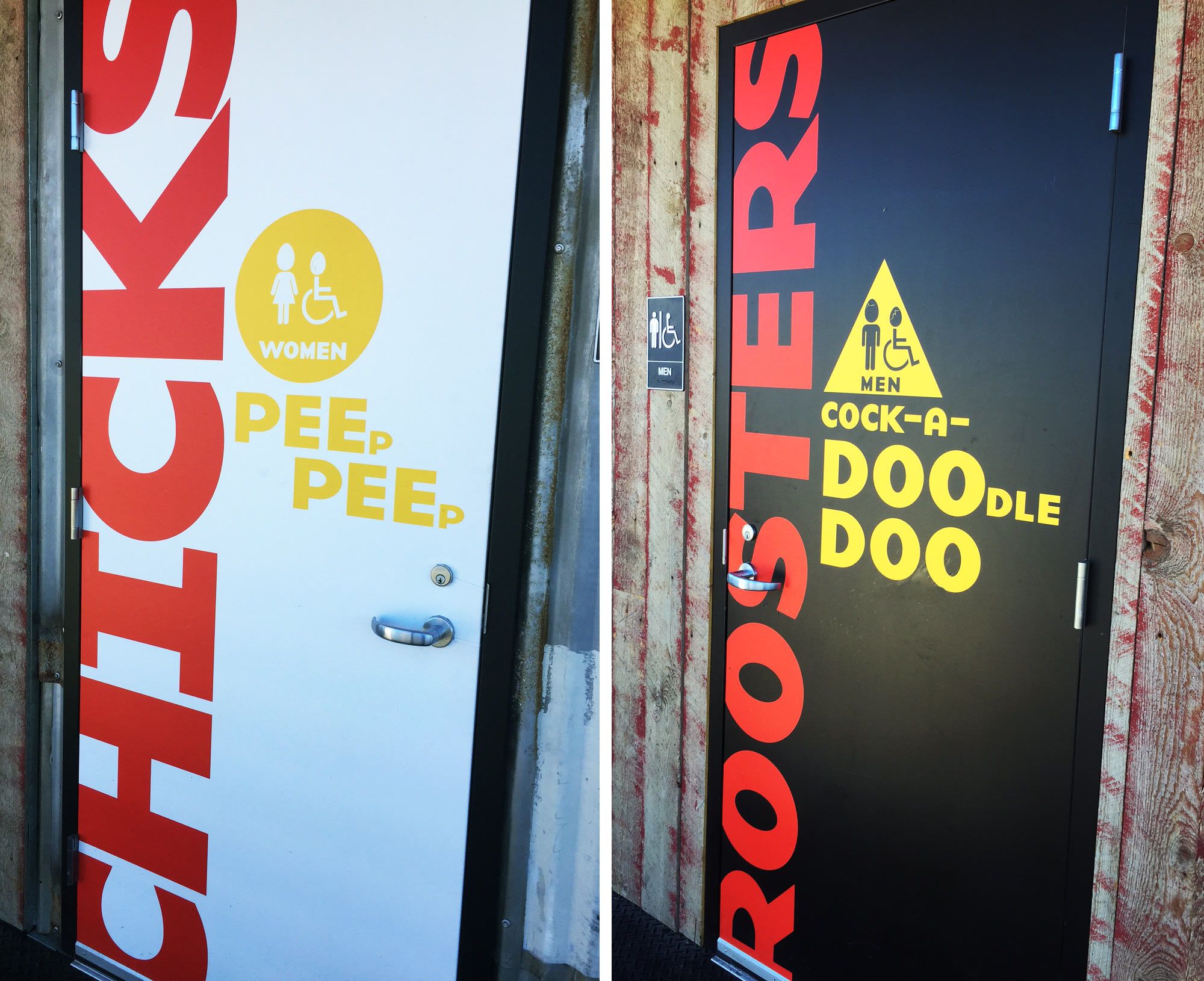
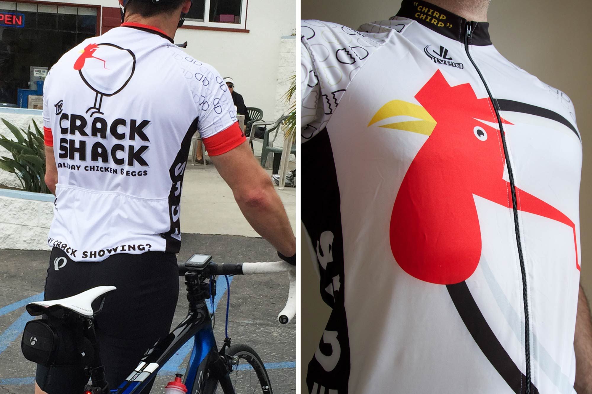
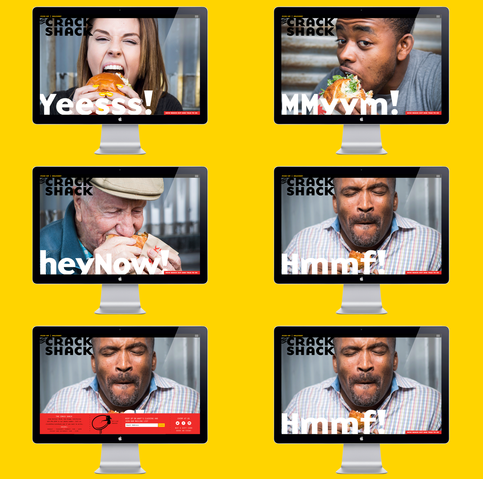
With Top Chef All Star Richard Blais as the chef behind the menu, we knew that nothing is too out there but everything would still be carefully considered. That combination is the perfect branding mixture for us to really have fun while developing a fully realized design experience. Starting with such an aggressive name that is both fun to say and hear, we wanted to make sure the branding matched up visually to that tone. We chose the ultra thick heavy, letters of the font Base to capture the sound of the words while the big round shape of the letters gives it a certain eggy-ness. Not to be missed are the two cracked egg shells found in the negative spaces of the “A’s”. Paired with our egg-meets-chicken logomark (that shows us what happens if the chicken and the egg occurred at the same time) we have the cornerstone of an incredible identity system which made the rest of the branding a breeze.
Services Performed: Brand Identity, Signage, Copywriting, Illustration